What is Color Theory?
Color Theory is an important tool utilized throughout the interior design industry. It is important to be knowledgeable of the physical construct of colors as well as the theory of how color is perceived and the emotions it can elicit. A good understanding of color theory will allow a designer to make informed, aesthetically pleasing selections for their clients that make sense. It is always nice to design a space that looks pretty, but when you can back up your choices with science, you add a higher level of credibility to your services as a professional. Here at Greenhouse Fabrics, it is important that our sales representatives not only speak knowledgeably about our fabrics, but also discuss the importance of color and make excellent suggestions for those that may need a bit of guidance in selections for their clients.
Color Theory is a large umbrella of study that encompasses color mixing, the physical qualities of each color, how colors are perceived physically by our eyes, as well as the psychology of colors and the emotions each can evoke. Color theory classes teach the significance of colors in different cultures. At the end of the class, a designer should be able to select colors that are not only aesthetically pleasing to the occupants, but also make sense for the activities that space will support. Your client’s favorite color may be yellow, but it could be a poor choice as the dominant color for their newborn’s nursery. As a designer, you may want to inform your client that while yellow is a very pretty color, it can also be too energetic and jarring in excess which could inhibit the quality of sleep for their newborn in the space. It may be best for the function of that space to choose a more calming, neutral color that coordinates and pairs well with yellow, so you can utilize their favorite color in accents and focal pieces. This is a way to use color theory to honor the preferences of your clients while also providing professional expertise that will benefit their individual needs.
The Color Wheel
Color Theory begins with the introduction of the color wheel. Most of us are very familiar with the three primary colors: red, yellow, blue. Every additional color is a combination of those primary hues. The next set of colors on the wheel are: green, orange, purple. The combination of those secondary colors produce our tertiary colors: blue-green, red-orange, red-violet, and yellow-green. When pairing colors together, the color wheel can be used as a road map to determine a color’s complementary, analogous, or triadic partners. A color’s complementary color is the one that falls directly across form it on the color wheel. The complementary color to red is green, while violet’s complimentary color is orange. The analogous relationship refers to the three colors directly next to each other on the color wheel such as yellow, yellow-orange, and orange or blue, blue-green, and green. The triadic relationship among colors is described as the pairing of a color with the two colors that are evenly spaced from it on the color wheel, creating an invisible triangle. These relationships can often been scene in color selections within beautiful floral patterned fabrics.
Working with Clients
While we experience the lessons covered in color theory every day, it is important to be able to speak about what we are experiencing and the choices we’ve made in an educated, professional way. It shows a level of expertise and will validate a consumer’s choice to employ our services rather than making selections on their own. While your client might not be aware of the actual definition of a tint and how it’s different from a shade or hue, using the terms properly goes a long way in the establishing credibility of your selections. Designers often share their mood boards or project boards with our sales representatives, seeking suggestions for samples they can show their clients that would work within their vision. The designer’s client may have never considered using an orange fabric for a room dominate in the blue hues; however, your knowledge that orange is the complimentary color of blue may provide that accent they were needing, but didn’t realize was missing. You may notice that a client of yours has used different shades in paints throughout their home. To them, they just have a blue room, a green room and a neutral room. However, you’ve noticed that each of those “hues” feature a bit of grey in them. Now while they may not know the definition of a shade (a hue plus the addition of grey), identifying that theme may inform your fabric selections. “I chose these fabrics because they look nice with the green walls” doesn’t sound as good as, “I chose these fabrics for your drapery because they all feature the same shades featured in your wall paint, and the orange flecks will create a complimentary, yet attractive contrast to the blue walls.”
Color and Emotions
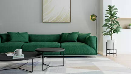
Colors are shown to impact our emotions, which make them amazing assets when designing interior spaces and selecting fabrics. Color theory discusses the positive and negative symbolism of each color while also the meanings they carry in other cultures. It is not surprising that red is perceived as natures warning sign, especially as we are conditioned recognize it in our stop-signs and stop-lights. Green is a very popular color utilized in interior design and has been show to relieve stress and help heal the occupants within. Many healthcare facilities utilize green contract grade fabrics in their interiors. Green is perceived to embody many of the calming qualities of blue as well as the energy felt from yellow. Yellow can be an uplifting, exciting color while also being perceived as jarring and abrasive. Color psychologists have found that yellow and red can stimulate the appetite while also making you want to leave. Based on this, many fast food restaurants (think of the golden arches!) utilize this color combination in their interiors to encourage their customers to eat quickly and leave. A great understanding of color theory might guide a designer to select fabrics with cool, calming colors for a hospice or holistic healing center rather than warm, bright and energetic colors.
We perceive the lessons of color theory every day. While we might not know all the definitions of the relevant vocabulary and the exact difference between analogous and tertiary colors, we understand how colors make us feel and how we seem to be more attracted to certain ones than others. Understanding the relationship between emotions and colors is imperative as a member of the interior design community. At Greenhouse Fabrics, you can see our love for color in the collections we release. Our dedicated sales representatives are here for you if you have any questions or would like help curating samples for projects.

