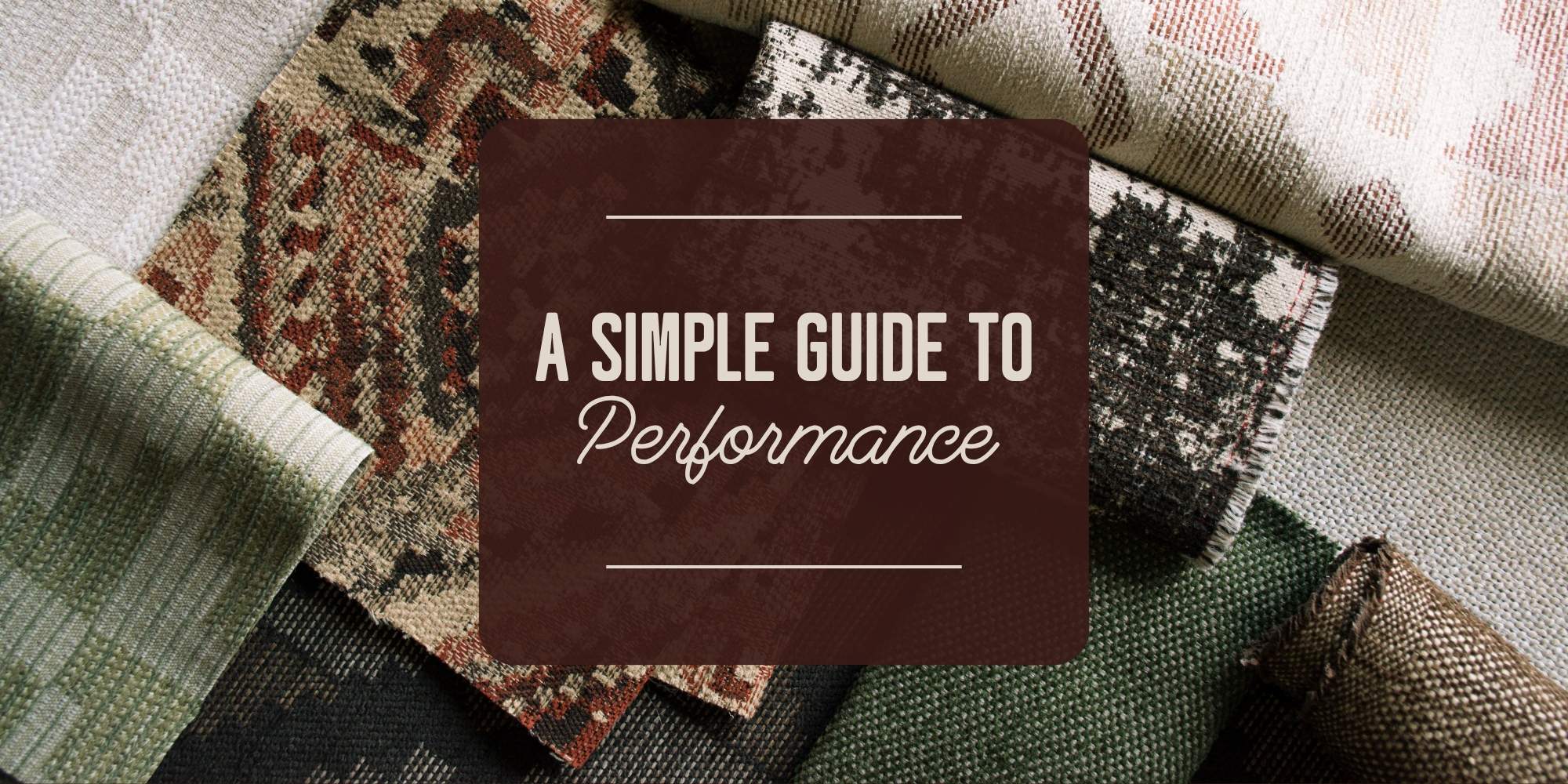
written by Rebecca Shell, Intern and Textile Student at NC State University
As a Textile Brand Marketing student, I have always been fascinated by the subject of psychology. Color meanings can greatly affect your brand, often playing an important role in how you are perceived by customers. Whether you have researched this topic for yourself or are new to the idea, understanding the comparisons that can be drawn between an industry rooted in science (psychology) and an industry consumed by fashion (textiles) is crucial.
What is Color Psychology?
Color psychology is the study of hues concerning human behavior. It is deeply centered around perception and how it affects our daily decisions. These perceptions are not obvious and can differ based on the individual.
The idea that color evokes emotion and aids in memory recall is nothing new. It can be utilized to manipulate thinking and buying decisions, making the subject incredibly important in branding and marketing.
Is It Really That Important?
In the world of business, it is sink or swim. Knowing how brand personality is determined by perceptions which are largely dependent on color can be the difference between surviving or disappearing. It is no surprise that color plays an important role in brand recognition and the actual appearance of products. Within 90 seconds, a judgment has already been made on your product, 62-90% of that coming from color.
With all of this being said, failing to follow the general guidelines of color psychology and confusing brand personalities can be detrimental to sales and company success.
Which Color Means What?
All colors have different meanings associated with each. Here are some of the most popular hues and their psychological explanations:
Green
Associated terms include fertility, health, generosity, and envy. This color continues to have strong ties to nature and fitness, which explains why many outdoor and fitness companies utilize this hue.

Blue
Competence, high-quality, stability, peace, masculine, and calm are some words associated with blue. Most descriptive terms are positive when thinking of this color, but it can be tied to negative emotions such as depression, loneliness, or cold. Many tech companies utilize this hue as to promote relaxation or trustworthiness. Facebook® and General Electric® utilize the color blue in their logos.

Pink
Characteristics associated include playfulness, femininity, sophistication, and sincerity. Victoria’s Secret® and Barbie® have successfully used these traits to their advantage, females making up most of their customer base.

Red
The color red is often used when wanting to grab someone’s attention. A very bold, bright color, red is often tied to terms such as lust, power, anger, and love. It also evokes feelings of hunger, which is why many fast-food chains include the color in their logo.

How Do I Apply This to the Textile Industry?
Overall, while the rules of color theory can be bent to create interesting design solutions, for the most part, customers tend to prefer colors that fit their specific needs. For example, customers looking for furnishings for a baby girl's room will typically be looking for a soft pastel color palette, while someone decorating a sunroom will probably be looking for more vibrant and natural prints. Meeting the needs of the customers in this basic way is sure to keep sales high and customers satisfied!
Subscribe to our blog for more inspiration.