Above all, HPMKT Spring 2025 reminded us that great design starts with a sense of self. Not just any home—their home. The most memorable spaces feel personal, like someone real lives there—someone with stories, quirks, history, and taste. As designers, that's the real work: translating who someone is into how they live.
As fabric people, we couldn't help but notice how every trend we saw could be translated beautifully through textiles.
The Return to Nature
Nearly every vignette had a grounded presence—rich rusts, sunbaked ochres, and deep mossy greens. These colors don't shout; they settle. Upholstered pieces in woven textures and washed palettes created spaces that felt rooted, intentional, and quiet in the best way.
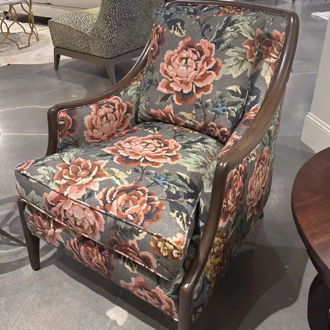
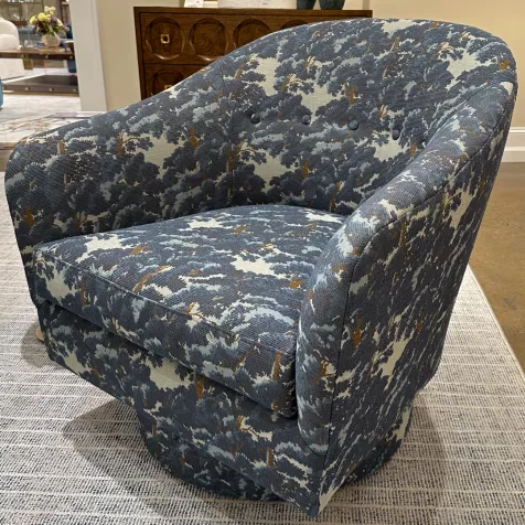
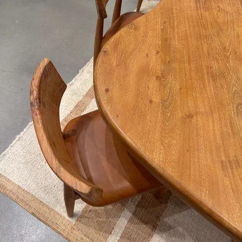
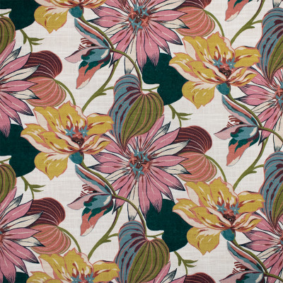
We saw large florals like S7519 Holly from our upcoming Spring Meadow Collection, soft, sweeping, and full of movement. Each piece covered in Kim Salmela's S7239 Baltic felt like a forest on fabrics, full of texture and tone-on-tone colors reminiscent of nature. A strong movement to medium wood tones has taken its claim, and I couldn't be happier. Wood tones bring such warmth and spirit into the home, and many fabrics pair perfectly with wood. This dining set spoke to me; with leather cushions like F2050 Gingerbread, it felt like stepping into a dream.
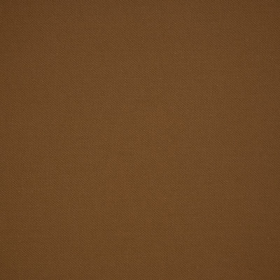
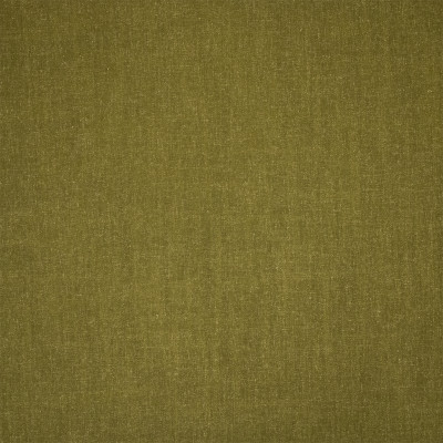
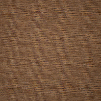
But nature-inspired design isn't only about the print; it's about the palette. Solid textures like S6472 Coyote, S7159 Fern, and F5539 Badger bring depth and saturation without distraction, acting as grounding elements that let other layers shine. These solids work like soil in a garden—quiet, supportive, essential.
Maximalism, but Make It Edited
Maximalism isn't back. It never left — it just grew up. What we saw wasn't chaos but curation, painterly florals paired with crisp stripes, and trims added to sofas and chairs that felt like personality with polish.
Truth be told, many HPMKT showrooms played it safe — beige, boucle, repeat. But when everyone else leans neutral, you get to make a statement. The spaces that stood out weren't afraid of color, scale, or story; they layered with intention and joy.
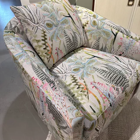
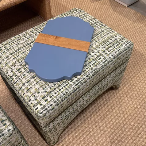
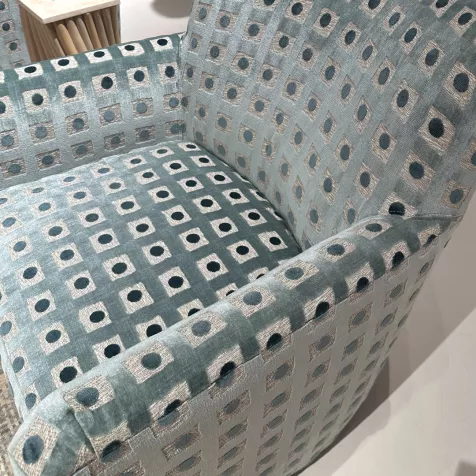
We saw it in pieces covered in S7298 Spring, where bright succulents brightened the space without feeling too loud. Or in a set of ottomans bringing nature's colors into the home with lots of texture using S6935 Emerald, a textured green-and-blue mix that felt tailored but lively. And perhaps most striking — a barrel chair upholstered in S7061 Glacier, where chunky texture met icy blue for a bold and composed look.
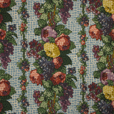
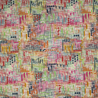
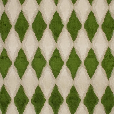
Maximalist fabrics don't just fill a space — they define it, offering designers a way to layer personality, pattern, and boldness into every square inch. Our collection Bohème speaks to the maximalist heart full of large florals, bold colors, and life.
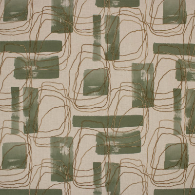
The Quiet Power of Color
The palette this season wasn't about novelty — it was about energy. Amber, olive, indigo, and wine made quiet, intentional appearances, offering grounded alternatives to the cool grays and stark whites of years past.
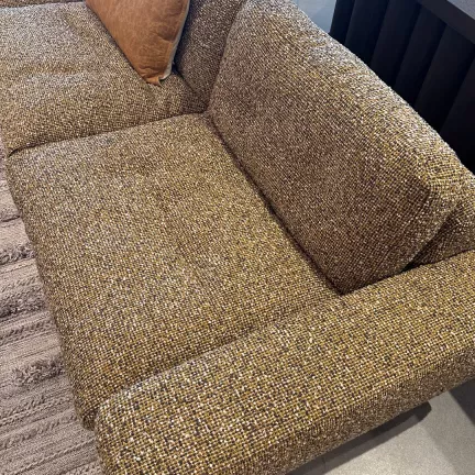
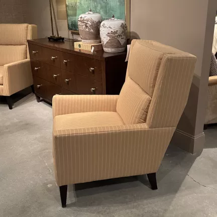
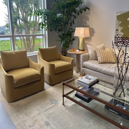
These hues didn't overwhelm. They anchored. We saw them used thoughtfully: a sofa in an amber boucle, a pinstripe chair in the perfect shade of tan, and lushly soft velvet gold chairs.
We felt that same balance in fabrics like S5961 Beige, a soft boucle that feels both rooted and refreshing. S7094 Oat is a nod to a menswear wool-blend pinstripe, bringing structure with a hint of drama. And S4157 Ambergold delivered warmth and elegance in a tone deep enough to ground a room but rich enough to stand alone.
Color is making its way back into interiors — not loudly, but confidently.
You don't need permission to be bold — just the right fabric. If you're ready to source fabrics that make a statement — quietly or not — our Fabric Concierge is here to help you find every layer.


